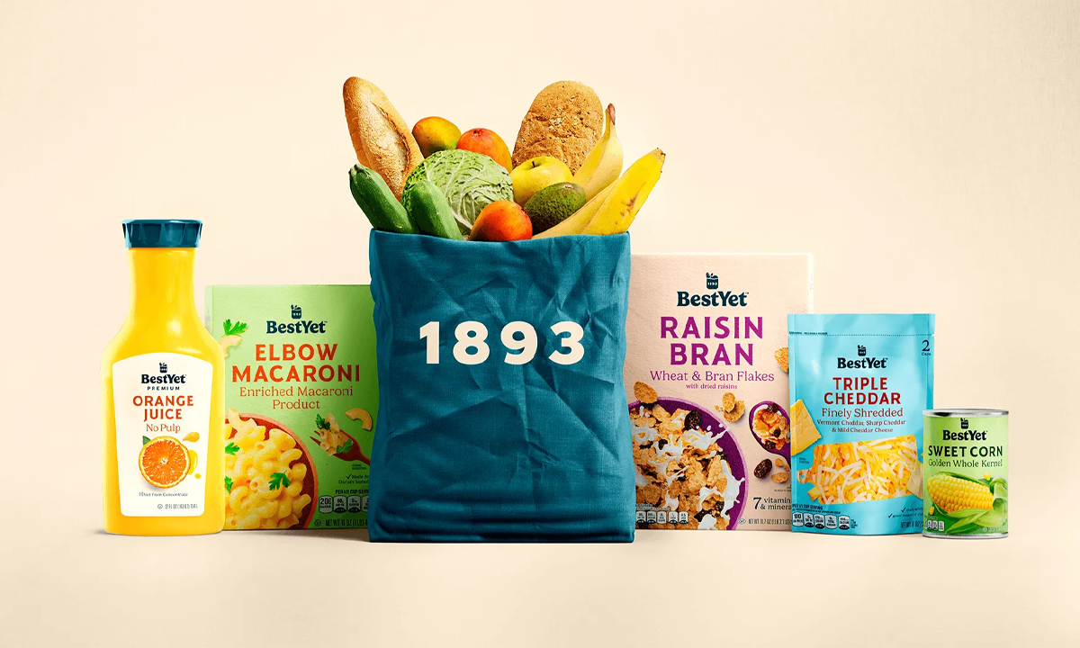
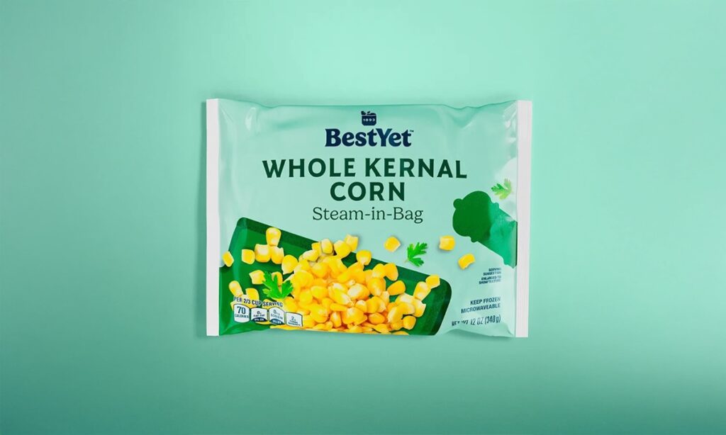
Private label used to mean compromise — dull, disposable, “good enough.” But shoppers today are sharper. They know when a brand’s phoning it in. Best Yet saw the tension: why should affordability come at the cost of joy or trust? Their rebrand with Pearlfisher flips that script. This isn’t your store brand’s store brand.
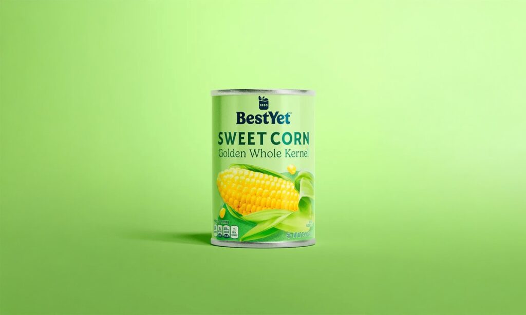
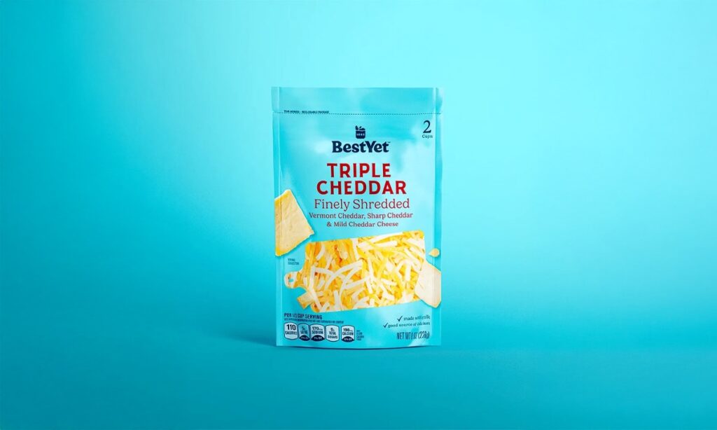
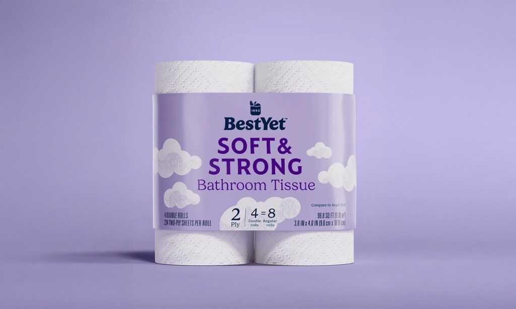
The design language leans into confidence and clarity. A bold wordmark — rooted in the brand’s 1893 heritage — anchors the system. Soft gradients and sunny backdrops bring an optimism that’s rare in value-tier packaging. And the product photography? Clean, graphic, sometimes even cheeky. Each SKU gets its own distinct personality without losing the throughline.
But it’s more than a pretty face. The system flexes across hundreds of products, from pantry to paper goods. The “Best Yet” name becomes a brand promise — echoed in merch, on-shelf signage, and even an apron that winks, “Best Recipe Yet.” This level of cohesion builds something bigger than recognition — it builds belief.
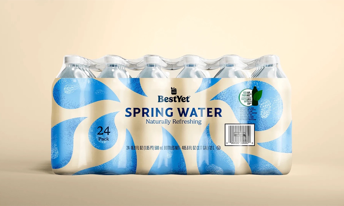
What this signals: private label is no longer the understudy. With design this sharp, Best Yet isn’t chasing national brands — it’s redefining what value looks like.
As a system, it wins by being confident enough to be simple, and smart enough to scale. The lesson? Cheap doesn’t have to look it. And when your design walks with pride, shoppers follow.
