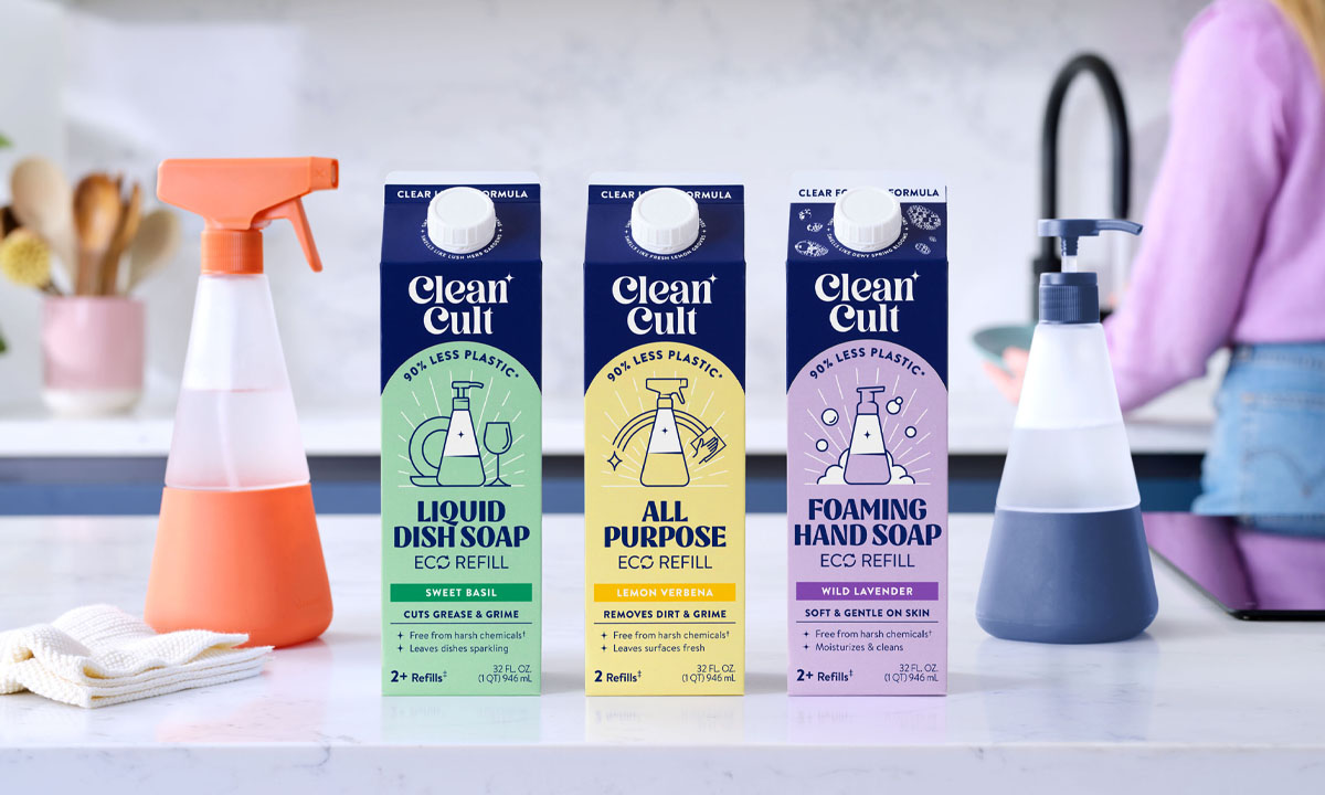
The sustainable aisle got boring. Beige labels. Guilt-trip copy. Brands talking about the planet, but not about people. Cleancult saw the shift early — refills were rising, but no one was owning the culture around them. So they made a bet: build a brand not just on low plastic, but high conviction. Treat refills like flexes. Make sustainability feel like a statement, not a sacrifice. And turn something as forgettable as dish soap into an identity you actually want to show off.
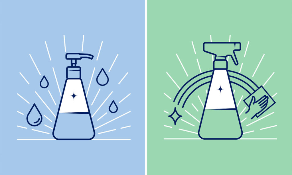
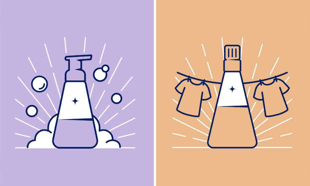
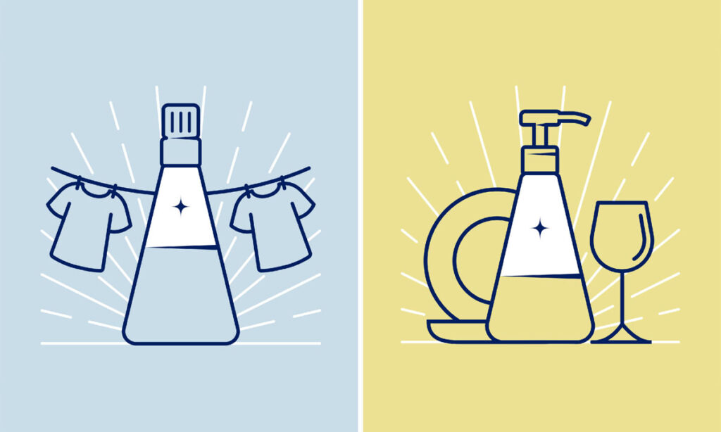
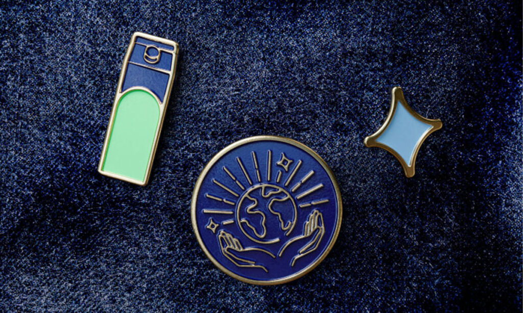
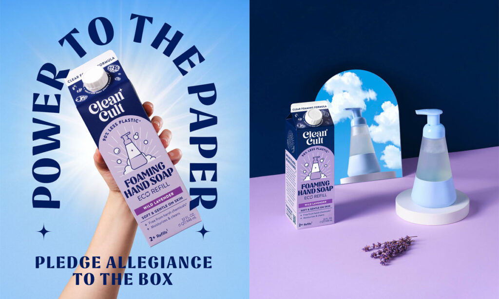
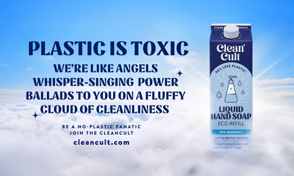
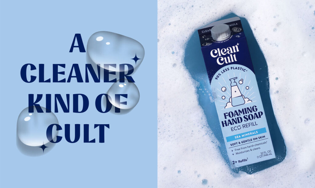
This is where it clicks. That name — Cleancult — gets the full cult treatment. The logo feels part wellness, part underground zine. The sparkle symbol shows up everywhere like a badge: on cartons, tees, pins, even protest-style posters. The typography is loud but elegant, like it belongs on both a billboard and a tattoo. And the color system breaks the eco mold — deep navy, zesty pastels, high-contrast layouts. It’s not trying to look “clean.” It’s trying to look claimed.
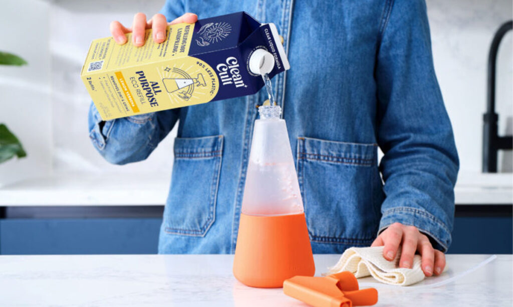
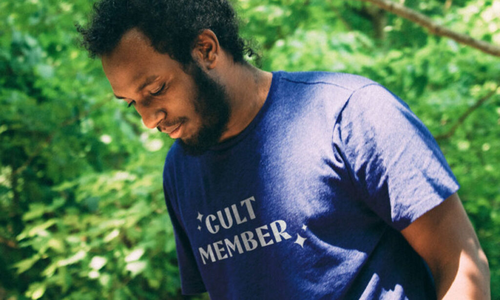
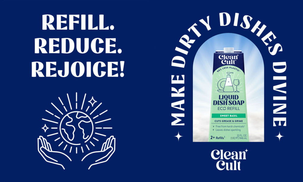
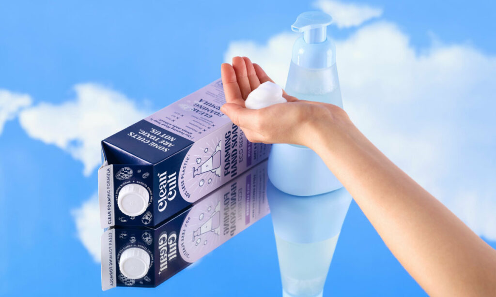
The system shows up like a brand drop. Cartons feel like product packaging and merch. Bottles become altars. Campaign shots stage them in dreamy mirrors and sunny fields, with slogans like “No-Plastic Fanatic” and “Refill. Reduce. Rejoice.” Even the OOH looks like a movement poster, not an ad. And the merch? It’s good. “Cult Member” tees. Pins. Totes. They’re not selling sustainability — they’re selling belonging.
This is bigger than a redesign. It’s a reframing. Cleancult isn’t in the cleaning aisle anymore — they’re in the culture business. And they’re proof that the next wave of sustainability isn’t about whispering virtue. It’s about designing belief systems. If Glossier made face wash personal, Cleancult just made dish soap tribal.
Here’s what Cleancult gets right: people don’t want to buy better — they want to be better. And this brand makes that feel cool, not clinical. For any creative trying to build behavior change into a brand, this is the bar. Don’t just sell the product. Design the feeling of being in the know.
