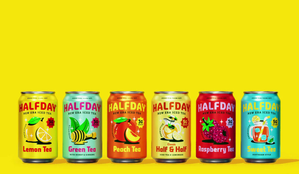
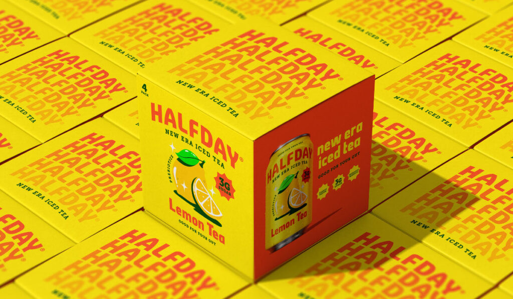
Halfday saw what every other better-for-you brand missed: if you want to change behavior, don’t sell benefits — sell energy. Before the rebrand, they had a strong product and a loyal niche. But in a category full of muted tones and subtle claims, they weren’t getting the kind of attention their mission deserved. So they flipped the strategy: don’t tone down. Turn up.
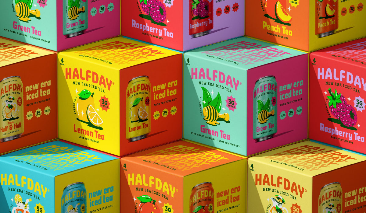
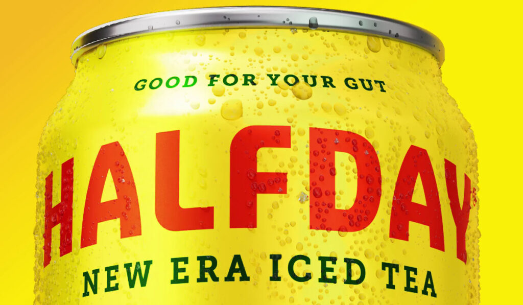
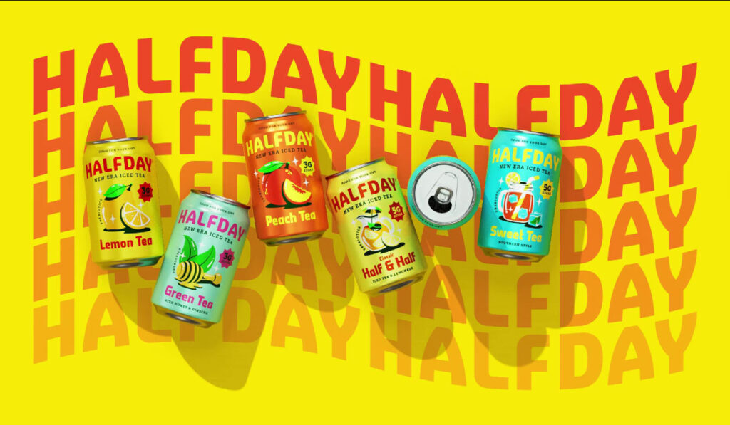
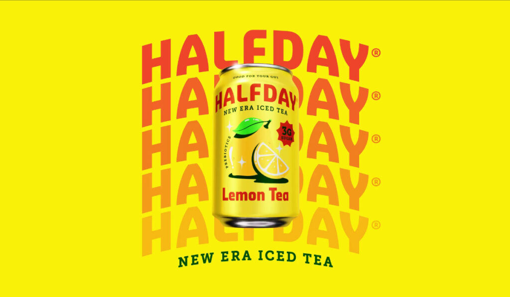
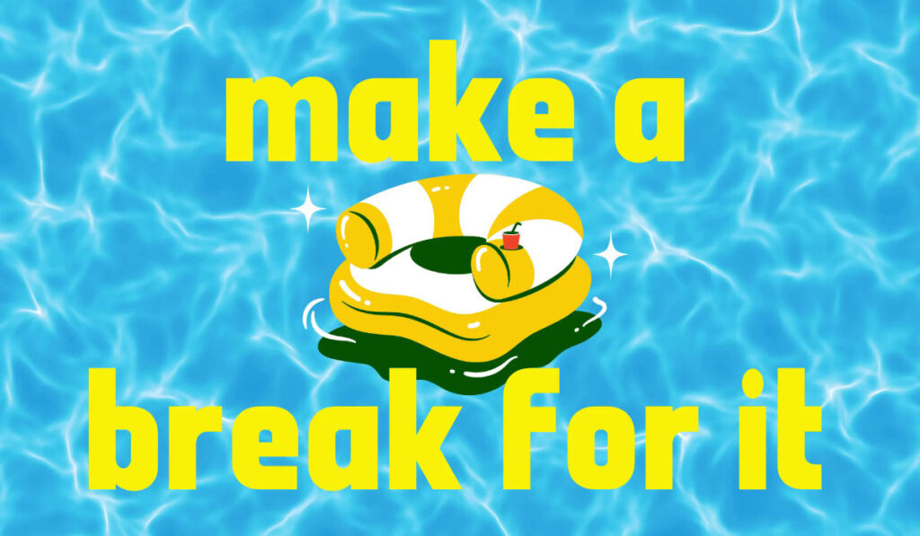
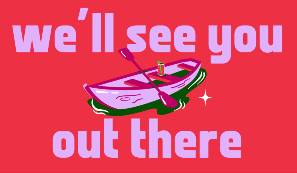
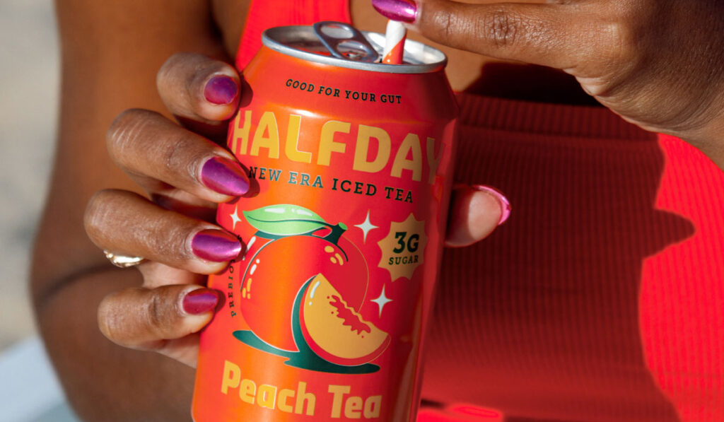
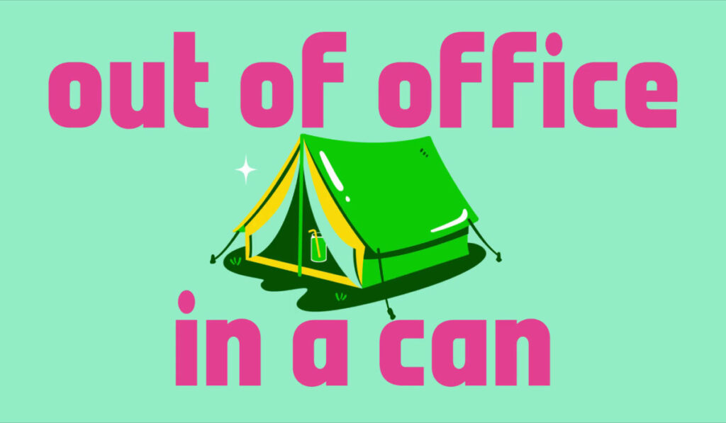
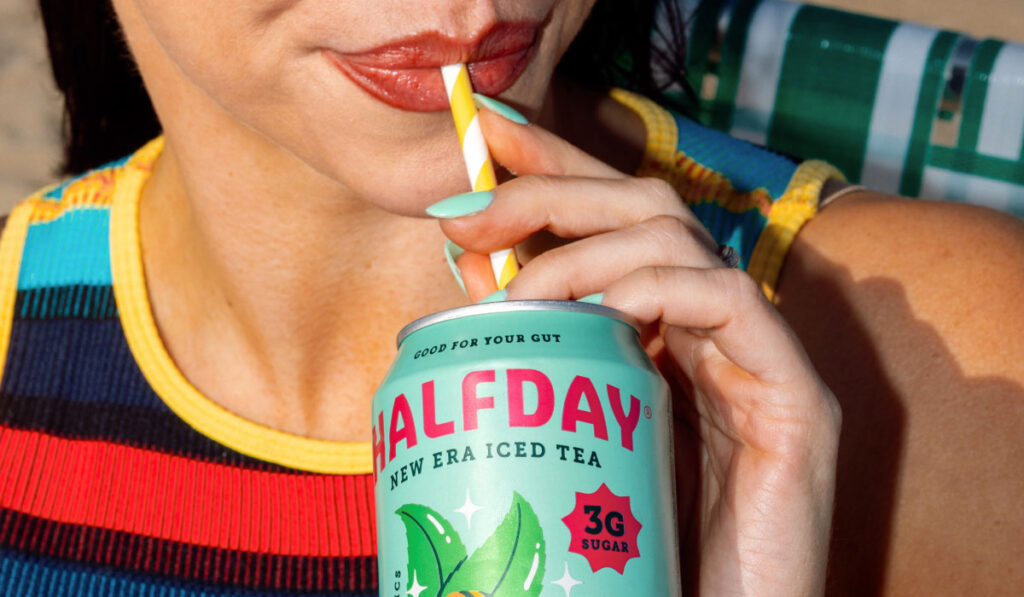
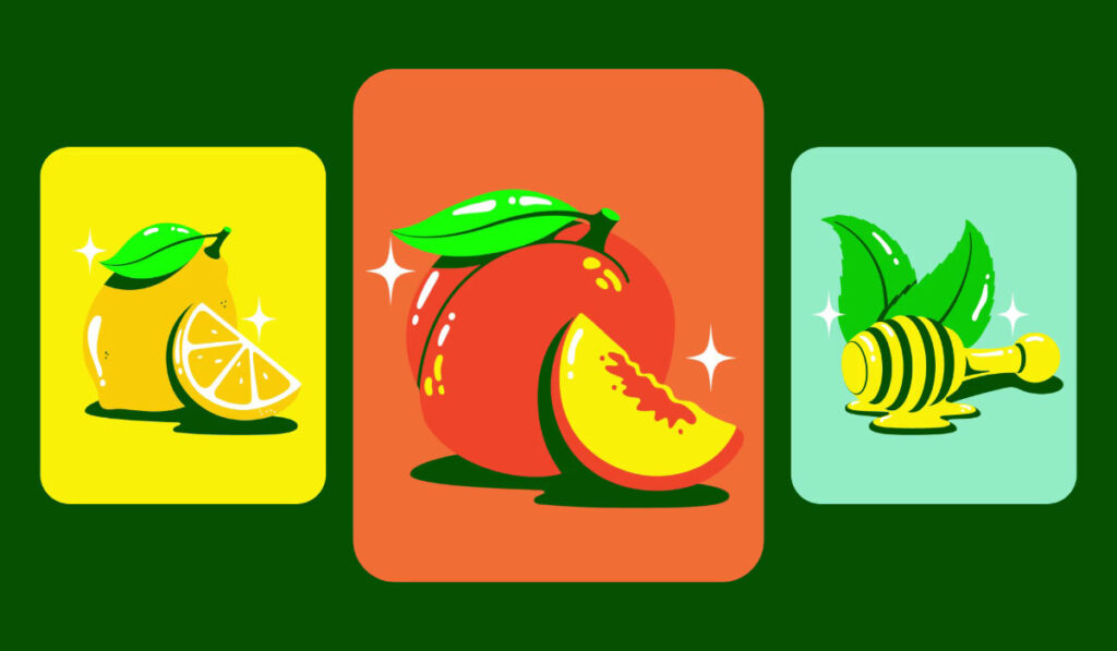
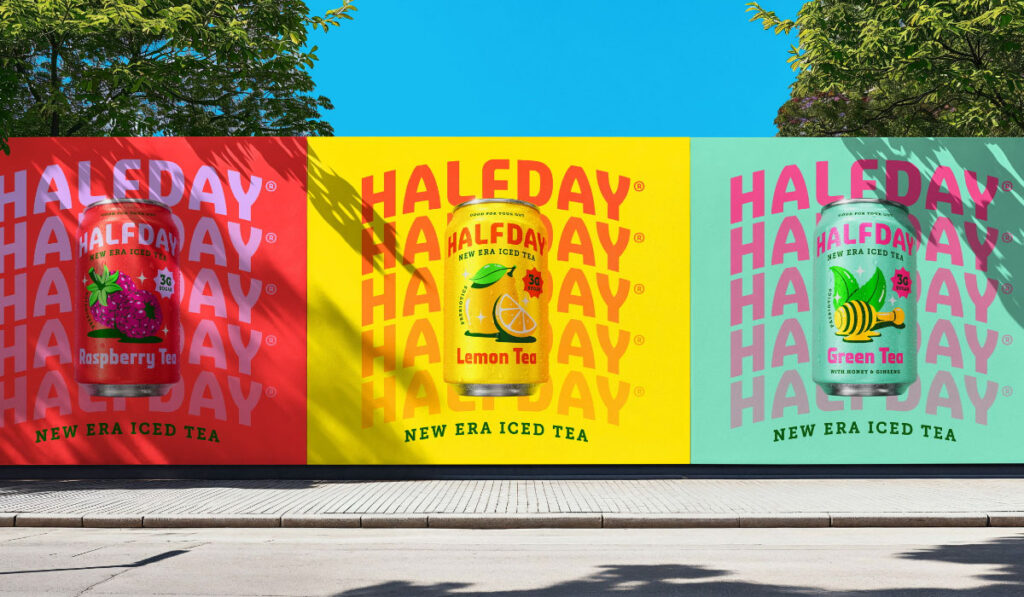
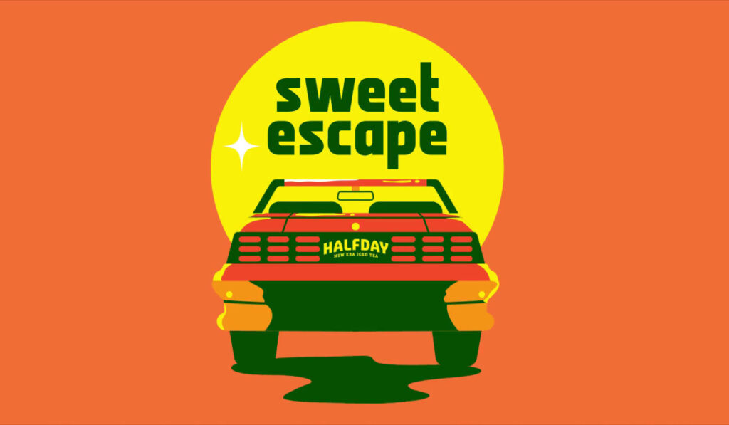
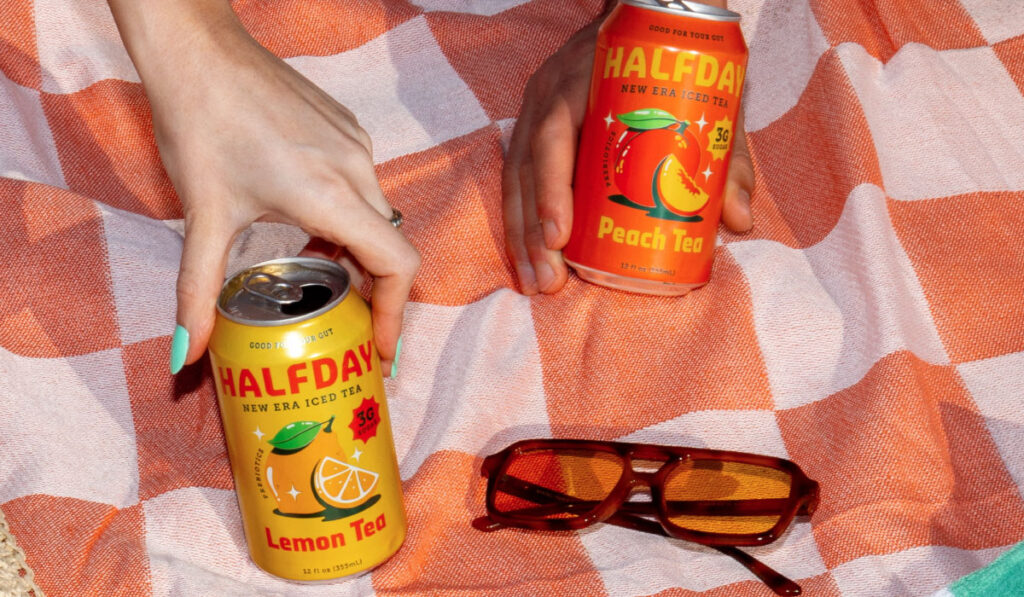
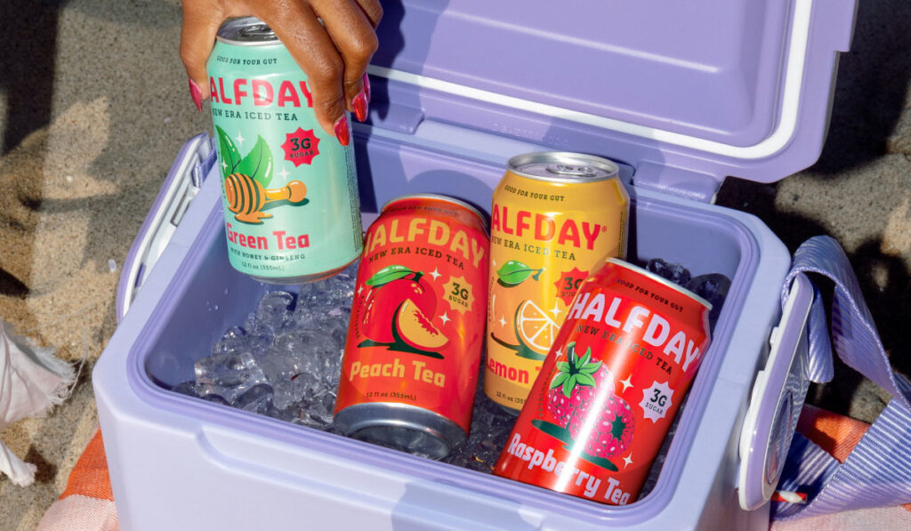
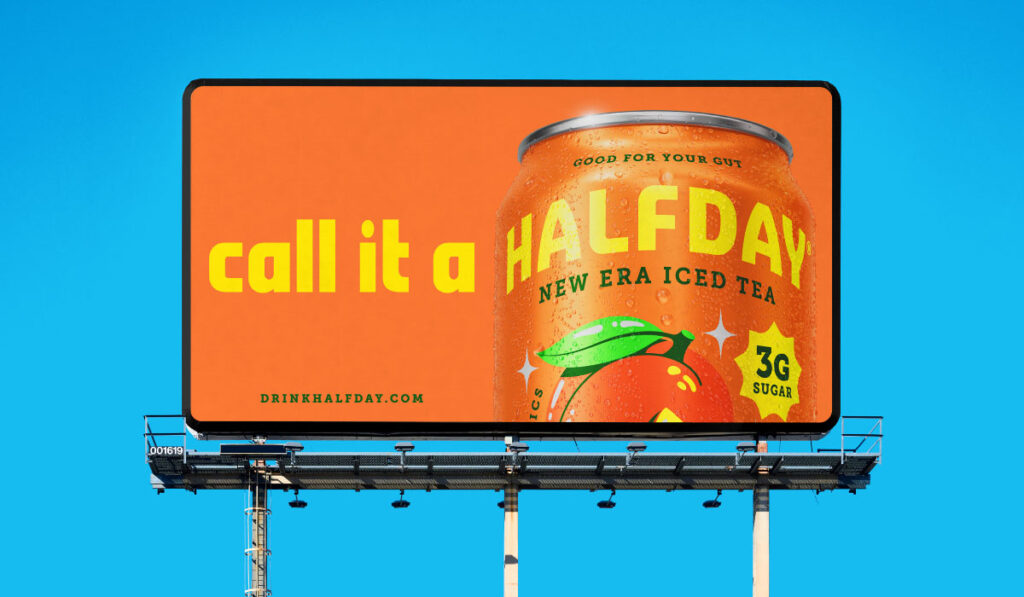
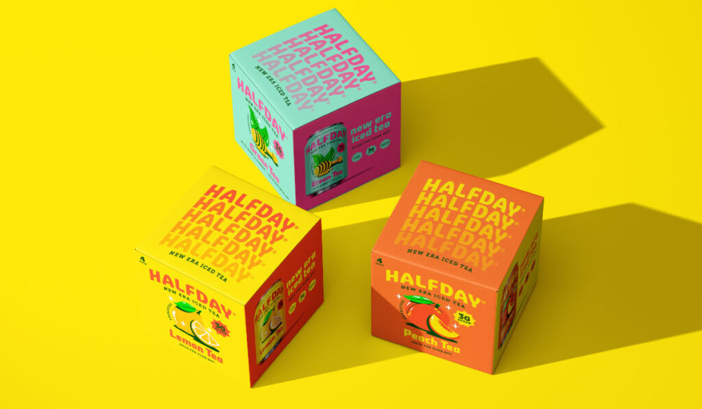
This rebrand? It’s not just visual — it’s behavioral. The new Halfday feels like a drop. The cans are loud, the copy’s louder, and the colors basically scream “put me in a cooler.” You’ve got flavor mascots that look like they just stepped out of a Saturday morning cartoon, type that’s bent like a warped summer billboard, and slogans that work better on merch than a sales deck. (“Make a Break for It,” “Out of Office in a Can,” “Sweet Escape.”) And that’s the point — this isn’t wellness trying to go mainstream. It’s culture-first design that makes you want to be seen with it.
Every touchpoint is dialed in. Billboards that double as memes. 4-pack cartons stacked like hype boxes. A product site that’s dripping in Y2K Americana. Even the ingredient callouts are positioned like sneaker specs — not preachy, just punchy.
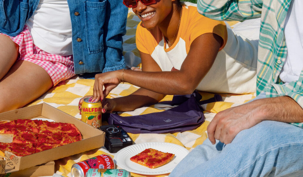
What you’re seeing is a brand that understands its role: don’t just sell the tea, sell the world around it. Because gut health isn’t the hook. Ownership is. Identity is. Joy is. And if Halfday can make something as functional as fiber feel like a lifestyle, that’s the playbook more brands need to study.
