Matty Matheson didn’t set out to build a sauce brand. He set out to bring his whole chaotic, joyful, flavor-bomb world into your pantry. The comfort of a Fort Erie BBQ. The chaos of a dinner where everyone’s yelling but everyone’s fed. The flavor of food that punches you in the mouth and hugs you after. But nostalgia—especially when it’s manufactured—can feel cheap. So Wedge didn’t design for retro vibes. They designed for Matty’s reality.
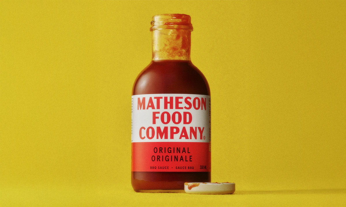
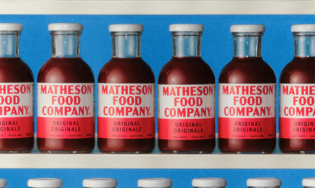
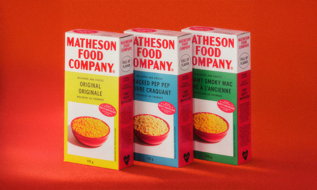
The identity pulls from the past, but twists it with personality. Inspired by Hereford Corned Beef cans—Matty’s childhood staple—it’s bold, primary-colored, and a little off. Condensed sans-serif type. Lo-fi layout. No perfect grids, no polite palettes. It looks like it was made with Sharpies and love. It’s not just vintage. It’s punk.
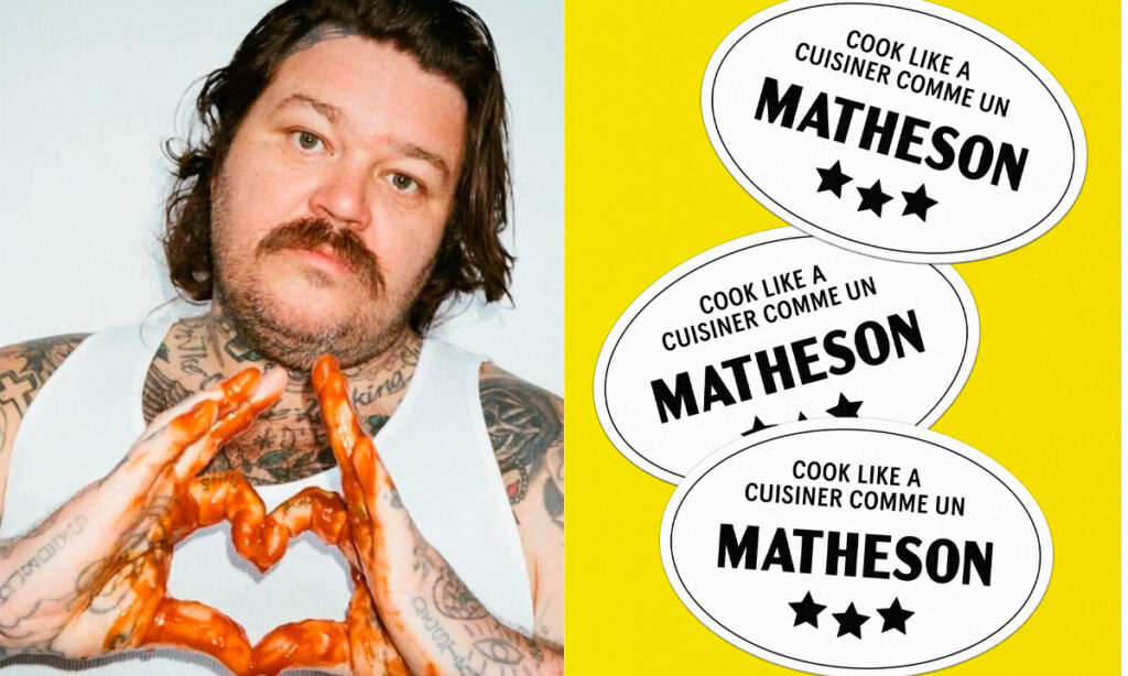
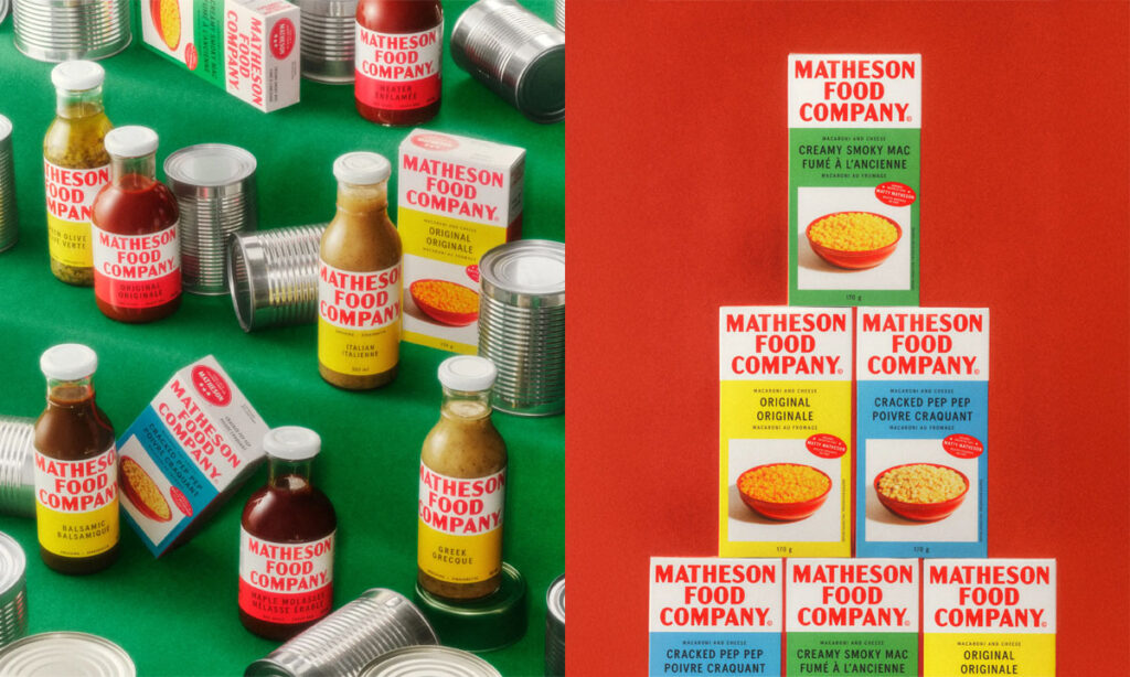
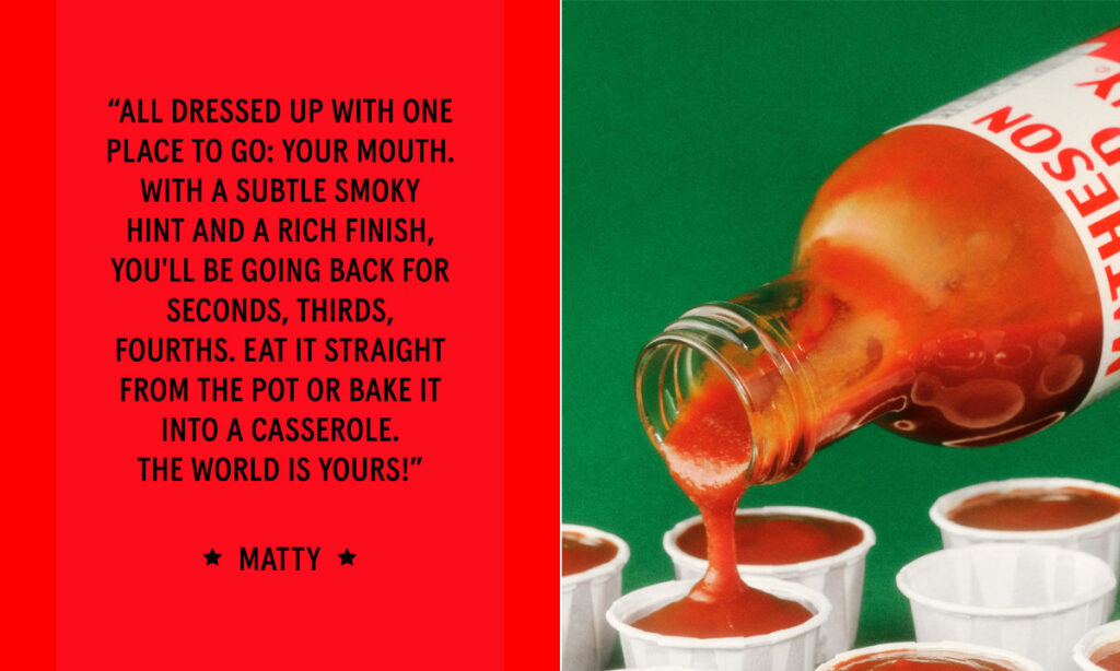
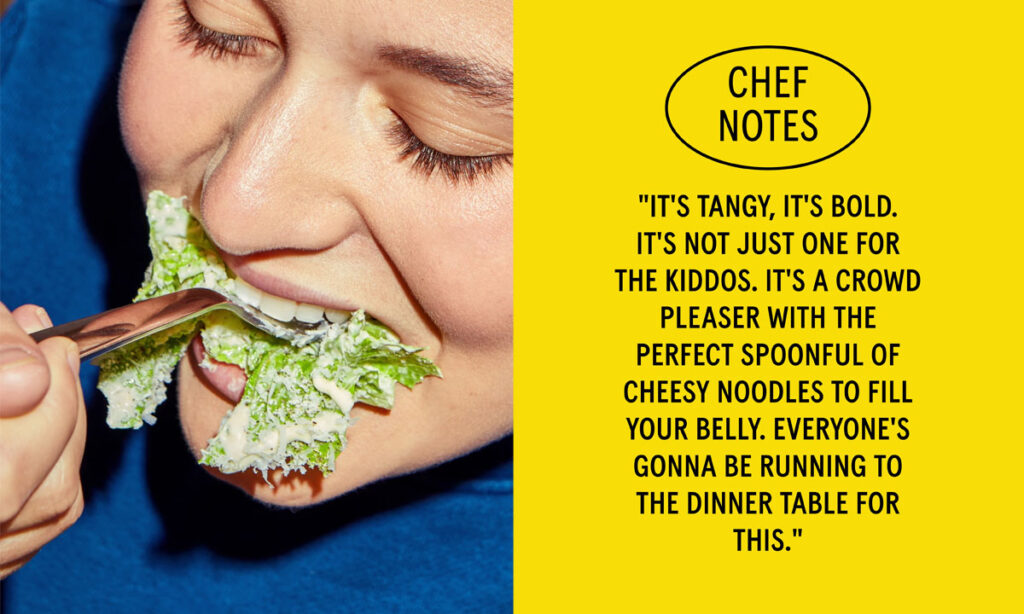
Every piece of packaging talks the way Matty does—direct, messy, magnetic. Mac n’ Cheese boxes don’t explain; they yell. Dressings come with family shoutouts. The photography feels like someone’s uncle took it on a disposable camera after a great meal. Even the tagline—”Cook Like A Matheson”—isn’t about being Matty. It’s about channeling that same chaotic care at home.
And the system scales. Walmart shelves. Merch. Maybe even a playlist. It stretches because it’s rooted in a world, not a look. These aren’t just pantry products. They’re touchpoints into a story you already want to be part of.

This is where chef brands are headed. Not clean, quiet luxury. But identity, voice, memory. You don’t need a Michelin star to matter. You need a POV. Matheson Food Company doesn’t feel like a launch. It feels like an invitation.